My Process
Research
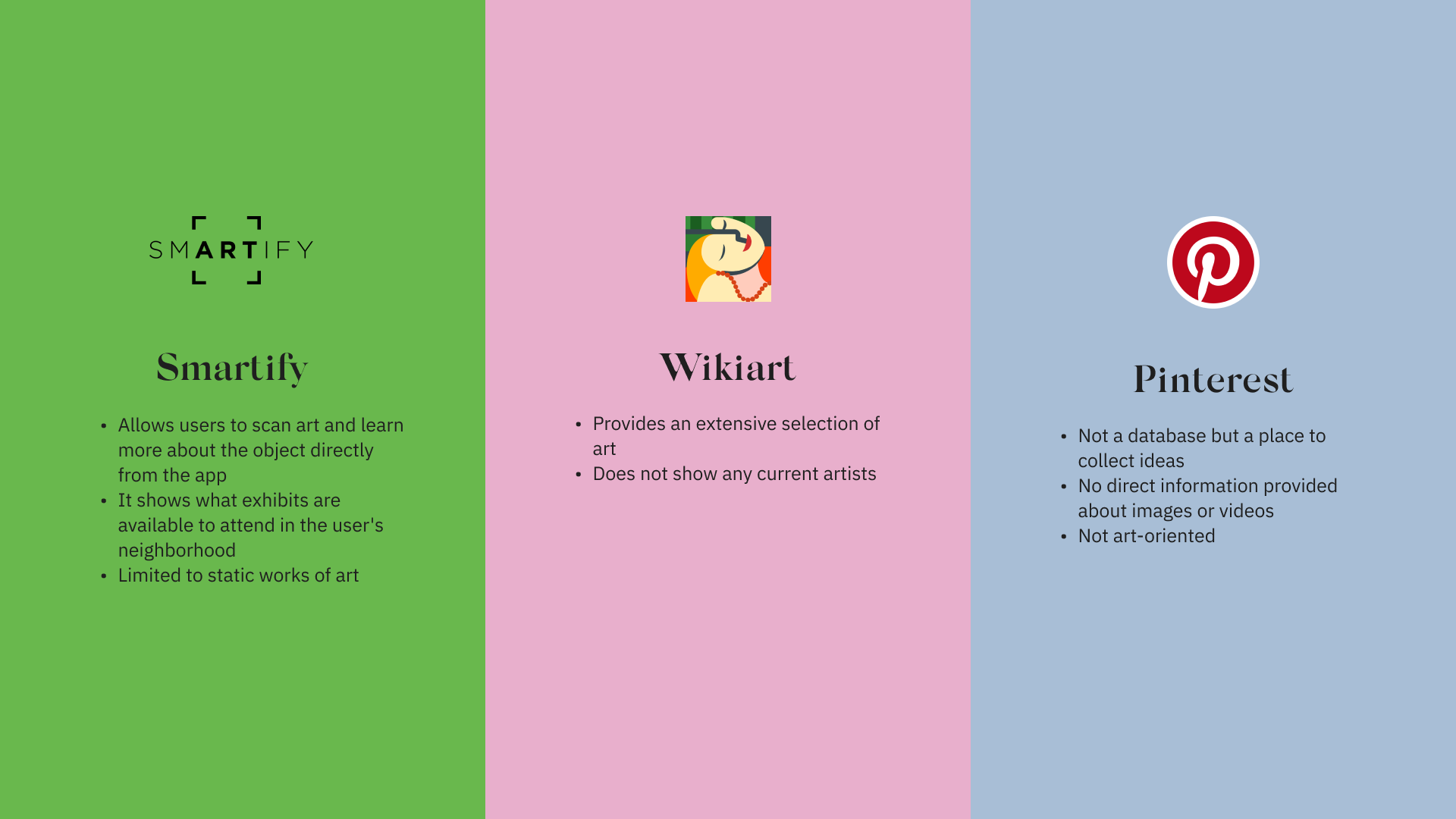
Competitive analysis and user testing revealed challenges and opportunities to introduce an art database app that serves a gap in the market. In response to these challenges, Artbase offers users a highly intuitive experience for iOS and Android users by staying true to Human Interface Guidelines and Material Design standards for visual styling, motion, and gestures.
Ideation
In addition to doing a competitor analysis to see what features I wanted to include or exclude, I also researched different UI/UX projects on Behance and Dribbble. Looking at various projects helped me develop other UI ideas to make Artbase look more fun and aesthetically appealing.
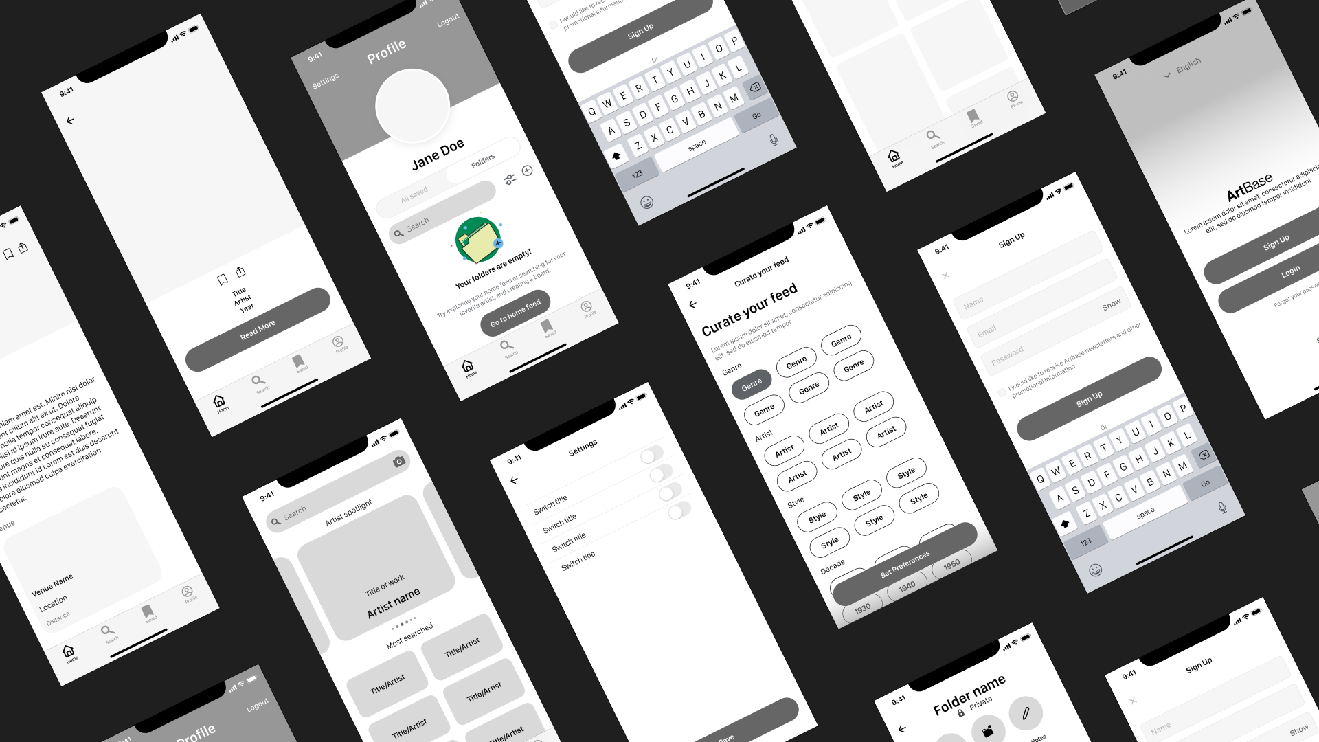
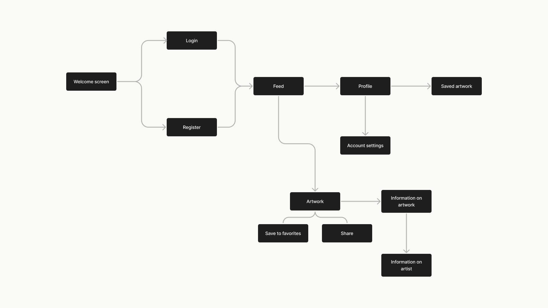
Wireframes
After figuring out the user flow for Artbase, I began designing the low and mid-fidelity wireframes that corresponded with these user needs.
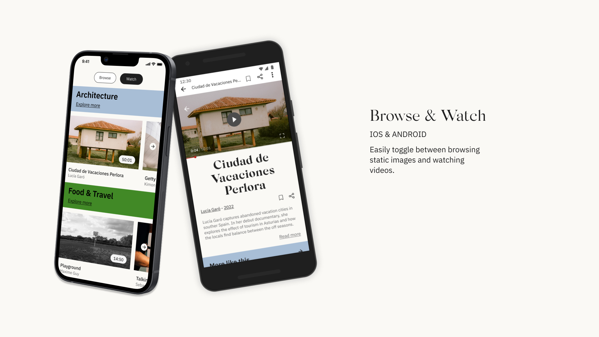
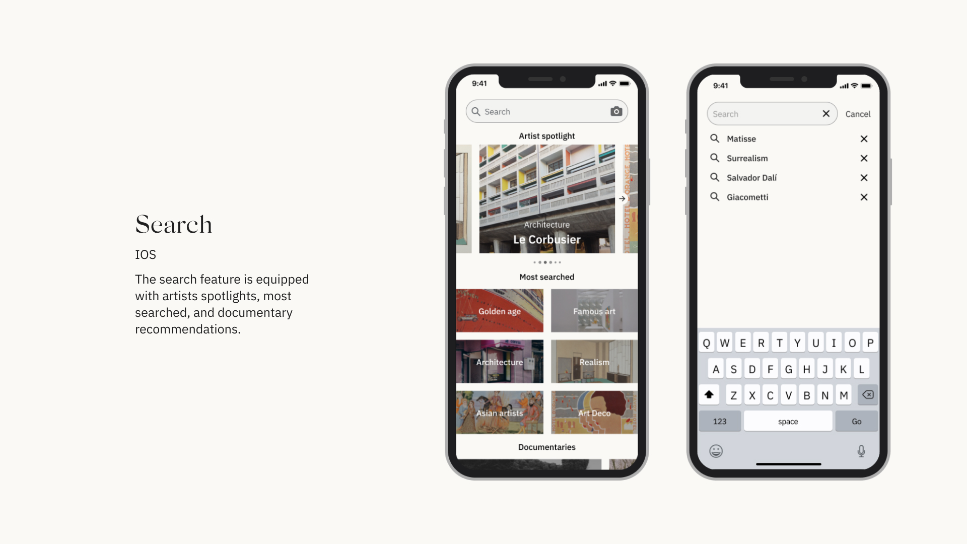
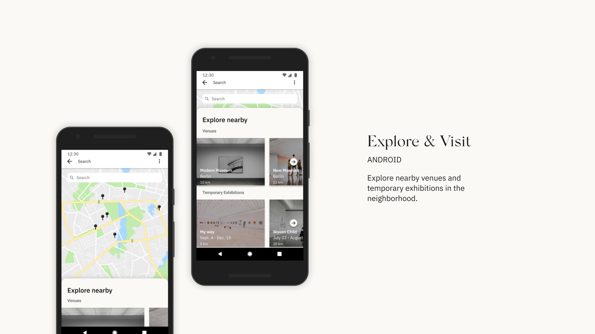
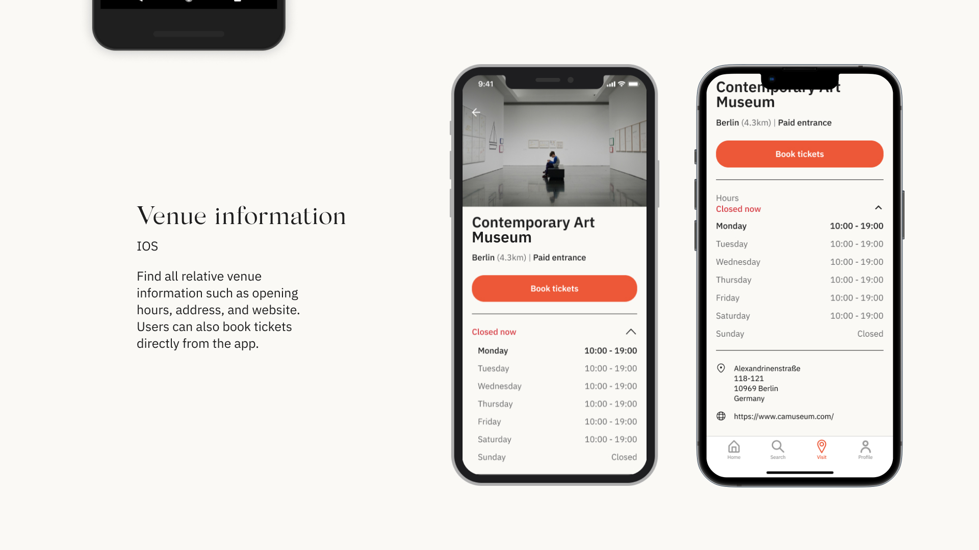
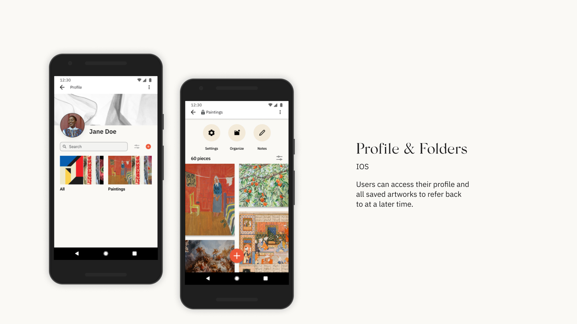
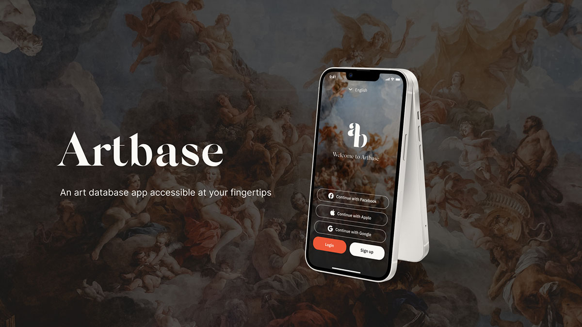
Design
The goal of Artbase is to make art and art education accessible to everyone on their terms. Typical databases can be cold and overwhelming, which is why it was important to design an interface that felt welcoming and educational, similar to a digital museum or gallery. While most of the app is designed in black and white tones, warm and vibrant pops of color are used as accents throughout the interface.